© 2023 Creative Strategist

Radi8

Radi8 Labs is a new digital service provider in the hospitality market, offering tools and services to make it easier for businesses to manage their operations. The client approached with a request to create a brand identity that would effectively communicate their services while being memorable and attention-grabbing.

Contribution:

Brand Identity, Stationary Design, & Communication Design

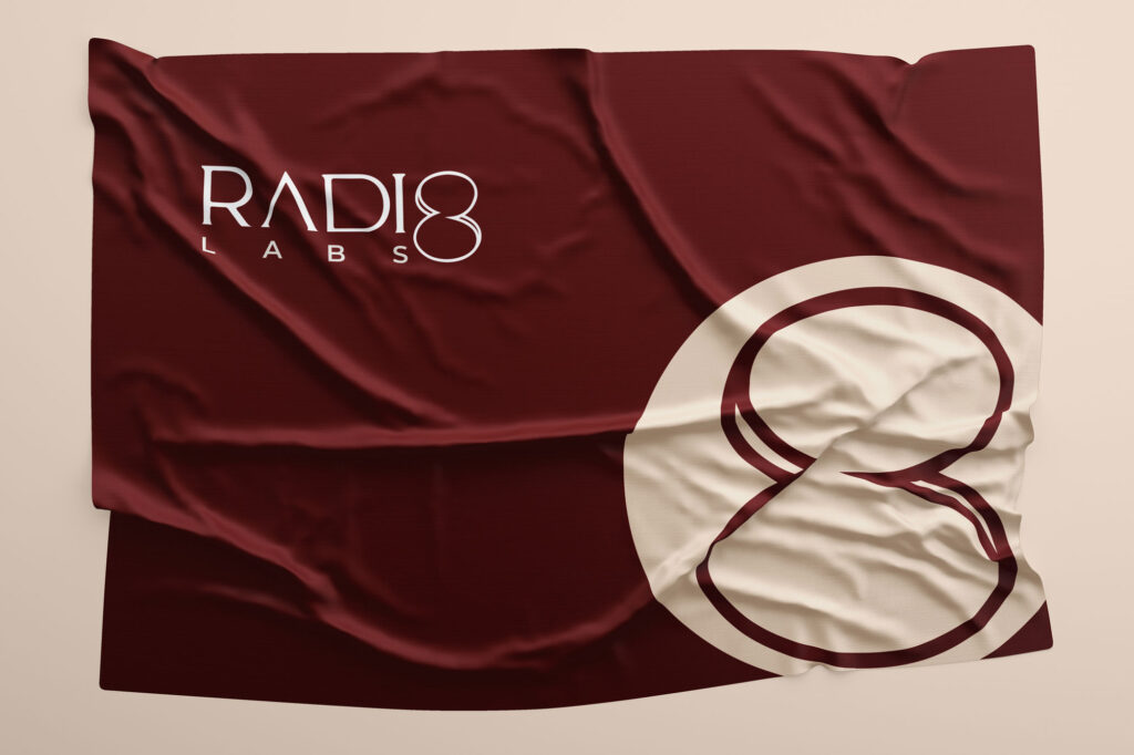
The Radi8 logo captures the brand’s essence through its distinctive design. Central to the logo is the number 8, an iconic element symbolizing infinity and growth. This uniquely shaped 8 stands out as the most captivating feature and serves as a standalone logo mark, representing Radi8 with bold simplicity.


The use of Serif typography complements this by conveying expertise and professionalism, reflecting the brand’s decade-long experience. Together, these elements create a cohesive visual identity that underscores Radi8’s commitment to innovation and excellence.

RGB: 171 35 40
HEX/HTML: AB2328
CMYK: 0 100 87 22
Pantone: 7621 C

RGB: 228 213 211

HEX/HTML: E4D5D3

CMYK: 4 12 5 0

Pantone: 7604 C

RGB: 188 165 165

HEX/HTML: BCA5A5

CMYK: 21 31 20 2

Pantone: 4086 C

Colors

Typography

Cardo

Cardo Bold

Montserrat

Montserrat Medium

Montserrat Semibold

Montserrat Bold

Crafted Dual-Tone Communication Style

we’ve meticulously developed a communication design style that embodies both assertive and passive tones, tailored to reflect the brand’s professional expertise and dynamic nature. Our strategy leverages typography and color to create distinct voices for different contexts, ensuring our message is always conveyed with the appropriate impact.

To assert the authority and expertise that Radi8 stands for, we’ve designed a bold and confident communication style. The primary color, Firebrick Red, dominates this tone, lending a sense of power and assertiveness. This striking red hue underscores our messages with a professional and authoritative presence, making it ideal for external communications, public statements, and brand promotions where a strong, clear voice is paramount.

Passive

For internal communications and situations requiring a softer touch, we adopt a more passive tone. Here, the primary color shifts to Wafer, a gentle and calming shade, with Firebrick Red becoming a secondary accent. This approach creates a warm and approachable atmosphere, perfect for team announcements, internal memos, and other communications where a more relaxed and informal tone is suitable.

Radi8_bcard

Let's craft
ideas together