Finest Culinary Dining Experience
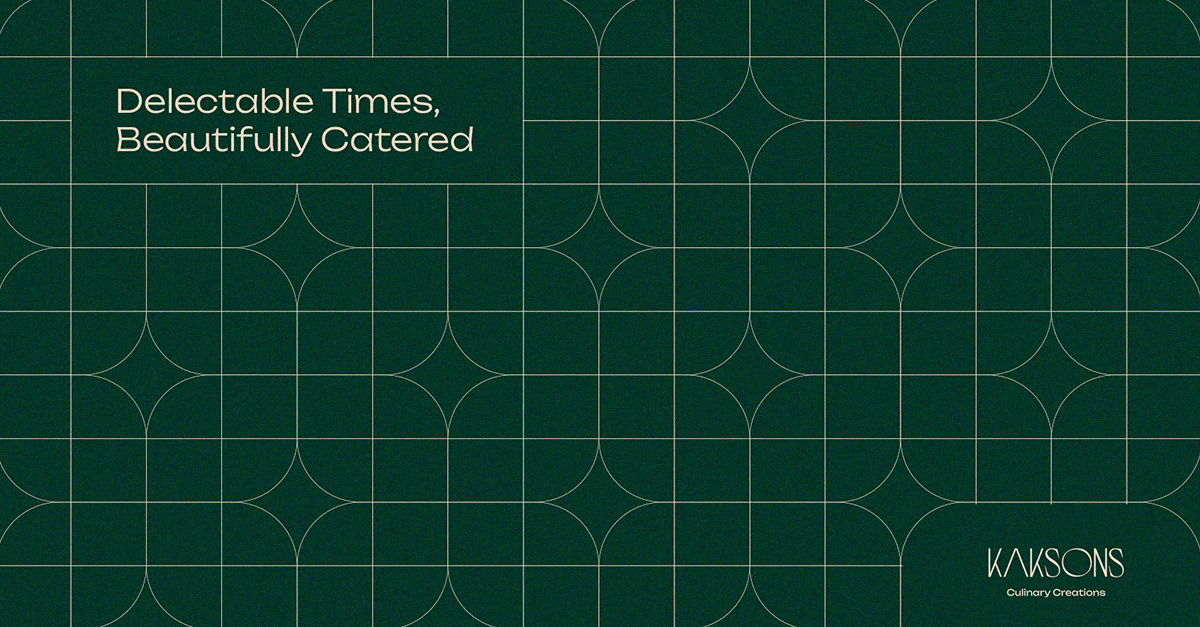
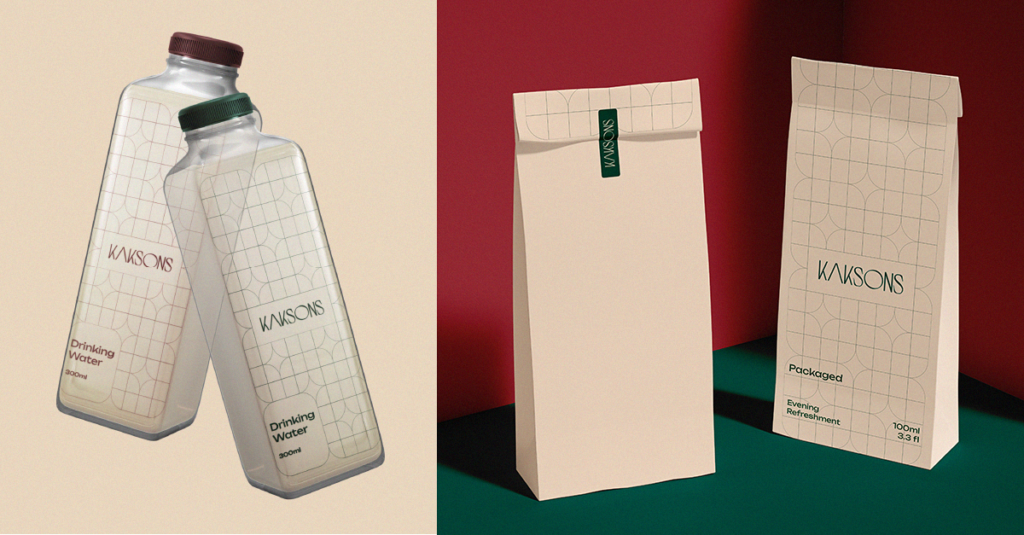
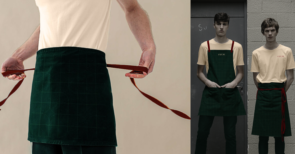
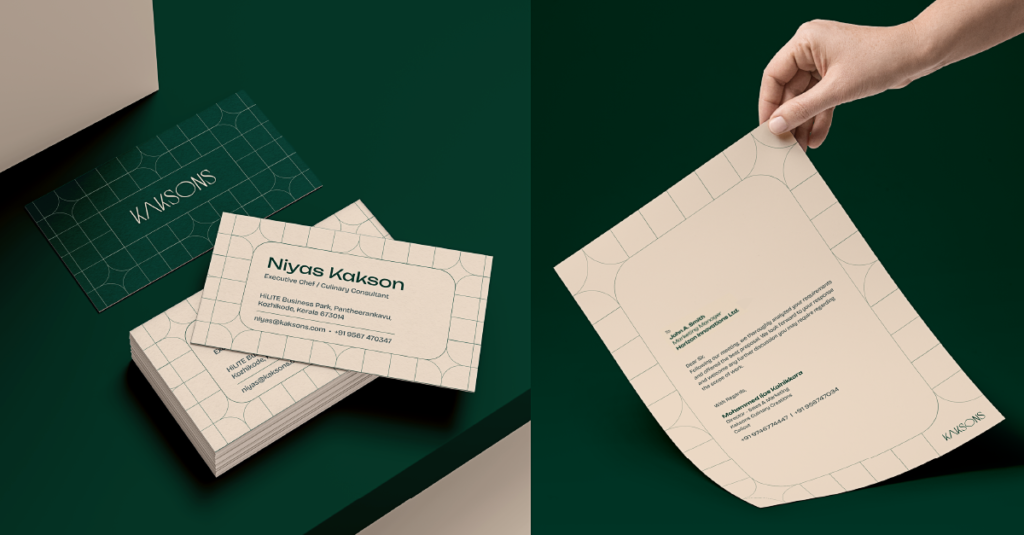
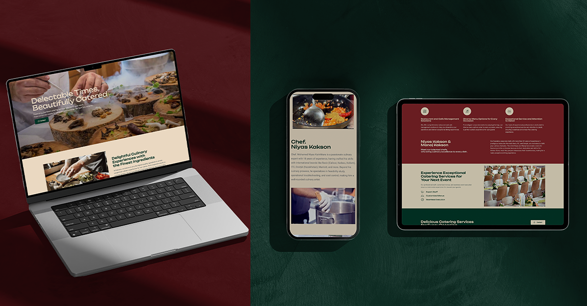
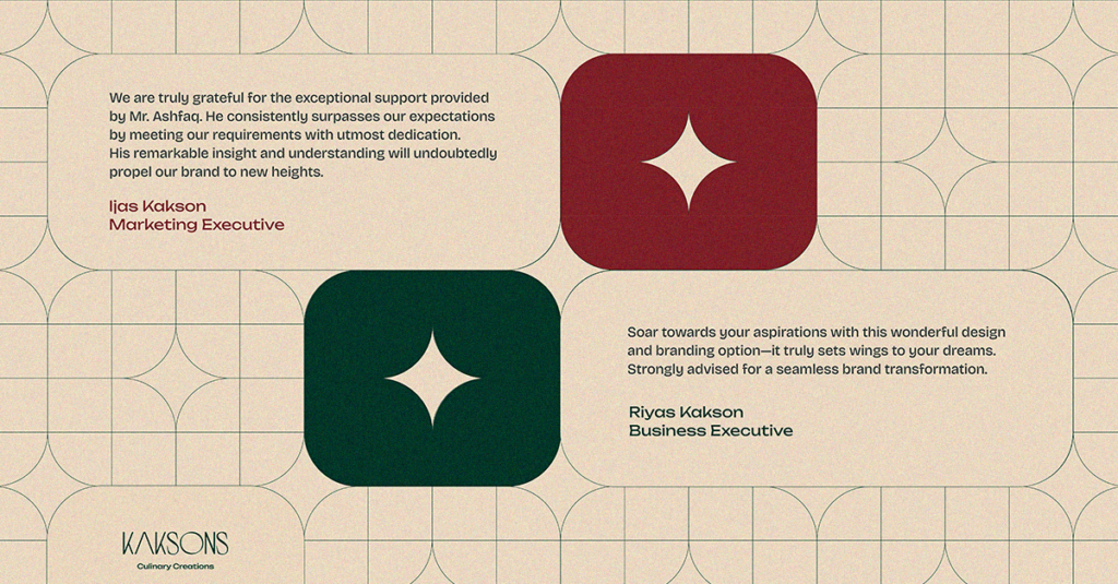
The design language for Kaksons Catering centers around a sophisticated geometric pattern, primarily featuring rich green and beige tones. This modern yet elegant aesthetic is consistent across all visual elements. The geometric grid provides a sense of structure and refinement, while the color palette adds warmth and sophistication. The branding uses clean, minimal typography to complement the intricate patterns, ensuring readability and a sleek look. This cohesive design language extends to packaging and uniforms, creating a unified and polished brand image that embodies the essence of culinary excellence and meticulous attention to detail.

